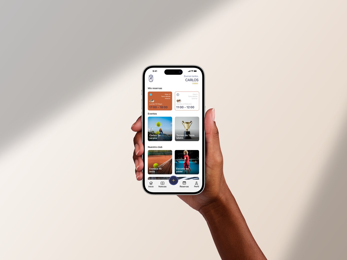
Reservation Redesign
C.T. Chamartin
Reshaping Reservations.
The existing app suffers from intricate user flows and a dated interface, impeding the seamless reservation process for both court bookings and additional club services.
A redesign was necessitated by the app's lack of user-friendliness and its inability to cater to a diverse user base.
Type
Application redesign
Methodology
User interviews, Wireframing, Prototyping, Usability testing
Duration
1 week sprint, July 2023
Role
Experience Designer


Objectives
The central objective of the app redesign was to optimize usability and user engagement. By simplifying the reservation process, the project aimed to alleviate usability barriers for the club's older demographic while encouraging more frequent usage of the app to explore club events, book private lessons, register for tournaments, and fitness classes, in addition to reserving tennis and padel courts.
User Research
Initial user research, encompassing surveys and interviews, revealed widespread dissatisfaction with the existing app. Valuable insights highlighted a preference for over-the-phone reservations due to the app's complexity. Feedback indicated an ardent need for a streamlined user experience and more accessible features.
Target Users
The app's primary users are club members and staff, including people of varying ages. The redesign took into account the wide range of users and their varying technological proficiency.
Take it from some of the members.
From clutter
to coherence
In the mid-fidelity design phase, my focus transitioned to refining the initial concepts into a more tangible and polished user experience. This stage bridged wireframes and high-fidelity designs, allowing me to enhance both function and visuals iteratively.
Gathering insights from initial wireframes and user feedback, I honed layout, typography, and visual hierarchy. This iterative approach balanced usability and aesthetics, making the app intuitive and visually appealing.
With the introduction of interactivity, I simulated user journeys, validating design choices. Collaboration was vital; I engaged users and stakeholders, integrating feedback to ensure evolving mid-fidelity designs aligned with expectations.
These mid-fidelity designs paved the way for the high-fidelity stage. By refining layouts, interactions, and visual cues, I established a solid base for final design. This seamless progression maintained coherence, providing a compelling user experience. Marking a critical point in our UX journey, mid-fidelity design harmonized function and aesthetics, refining interaction, and guiding the path to a delightful and intuitive end product.
to clarity.
Design Process
-
Preliminary wireframes were crafted to envision the revamped reservation process.
-
Realistic user simulations were conducted using the wireframes, generating early feedback for iterative enhancements.
-
Iterative mid-fidelity designs emerged from user input and competitive analysis, driving further refinements.
-
Refined designs underwent comprehensive usability testing to curate an optimal user journey.
-
The final design embraced the club's color scheme, and modern typography, infusing the latest UI trends while maintaining brand consistency.
Info. Architecture
A restructured information architecture spotlighted essential booking details on each screen. This ensured straightforward decision-making and a streamlined user flow, eliminating user confusion.
Visual Design
Leveraging the club's signature blue and white hues, the redesign incorporated contemporary typography and design elements to provide a refreshed and appealing visual experience.
Revamped Reservation Process
Revamp
〰️
Reimagine
〰️
Reshape
〰️
Revamp 〰️ Reimagine 〰️ Reshape 〰️
1
A prominent "Start Reservation" button ignited the reservation journey.
2
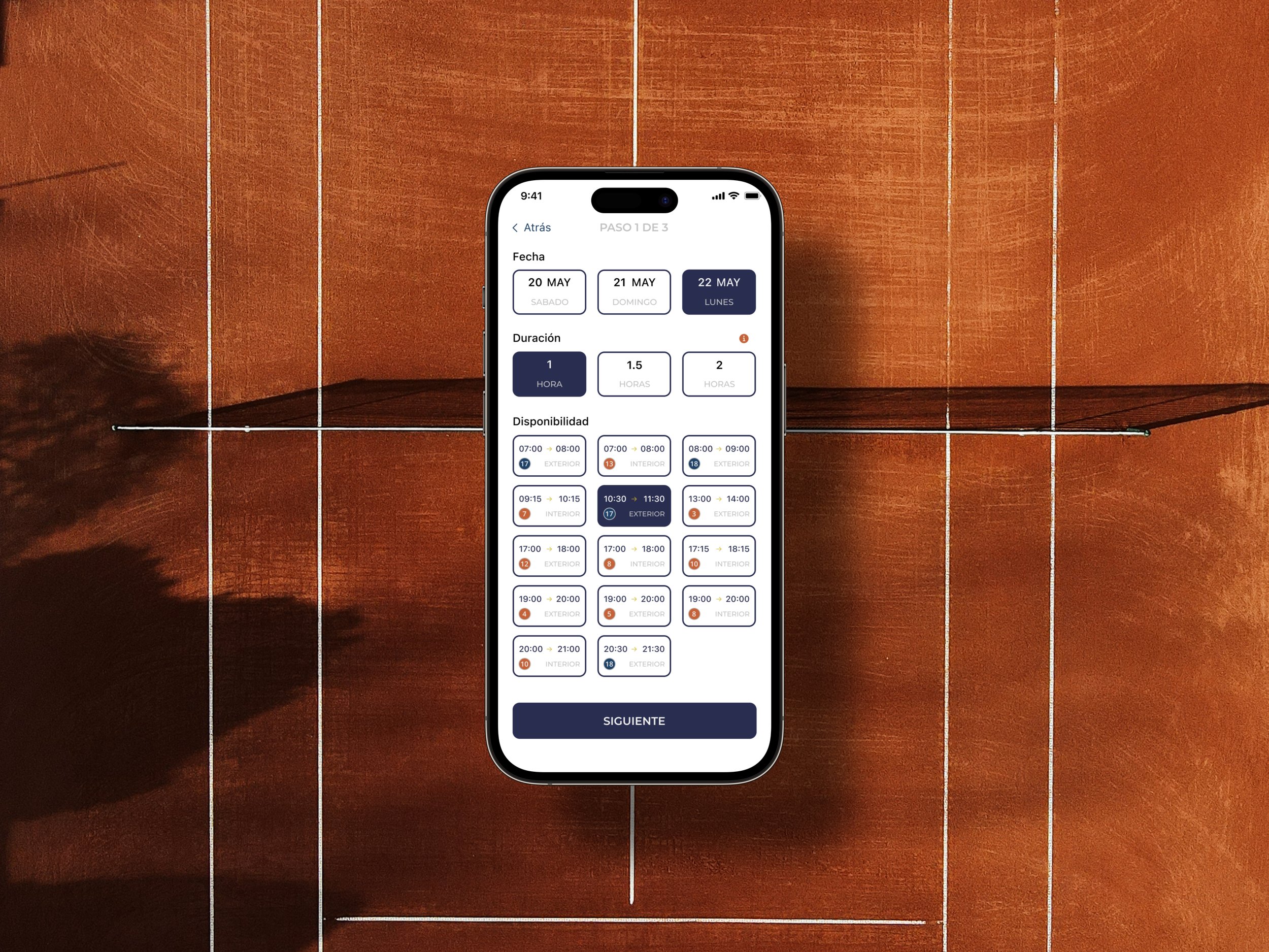
The current date and the following two days were presented in compliance with the club's booking policy.
3
Users selected the preferred reservation duration (1, 1.5, or 2 hours) with illustrative explanations.
4
Courts were displayed with real-time availability, coupled with surface details and indoor/outdoor distinctions.
5
Player additions were streamlined, enabling users to invite friends as well as fellow club members.
6
A summary screen condensed reservation specifics, encompassing player names, date, time, and court particulars.
7
Payment options encompassed credit card, mobile pay, and club credits for a seamless transaction.
8
View reservation details. Play the game. Win. Enjoy.
Challenges & Solutions
Navigating the intricacies of dynamically changing reservation stages posed a challenge. Careful curation of displayed information at each phase emerged as the solution.
Lessons Learned
Design Inspiration: Drawing inspiration from existing applications while orchestrating efficient information rearrangement streamlines user journeys.
Information Prioritization: Contextual information hierarchy ensures users are presented with relevant details at each stage.
User-Centric Iteration: User involvement and iterative design are integral to crafting a user experience that resonates with diverse user groups.
Results & Impact
While not fully implemented, the prototype demonstrated promising outcomes. Anticipated improvements encompass increased user engagement, heightened member satisfaction, and a notable decline in reliance on alternative booking methods.


